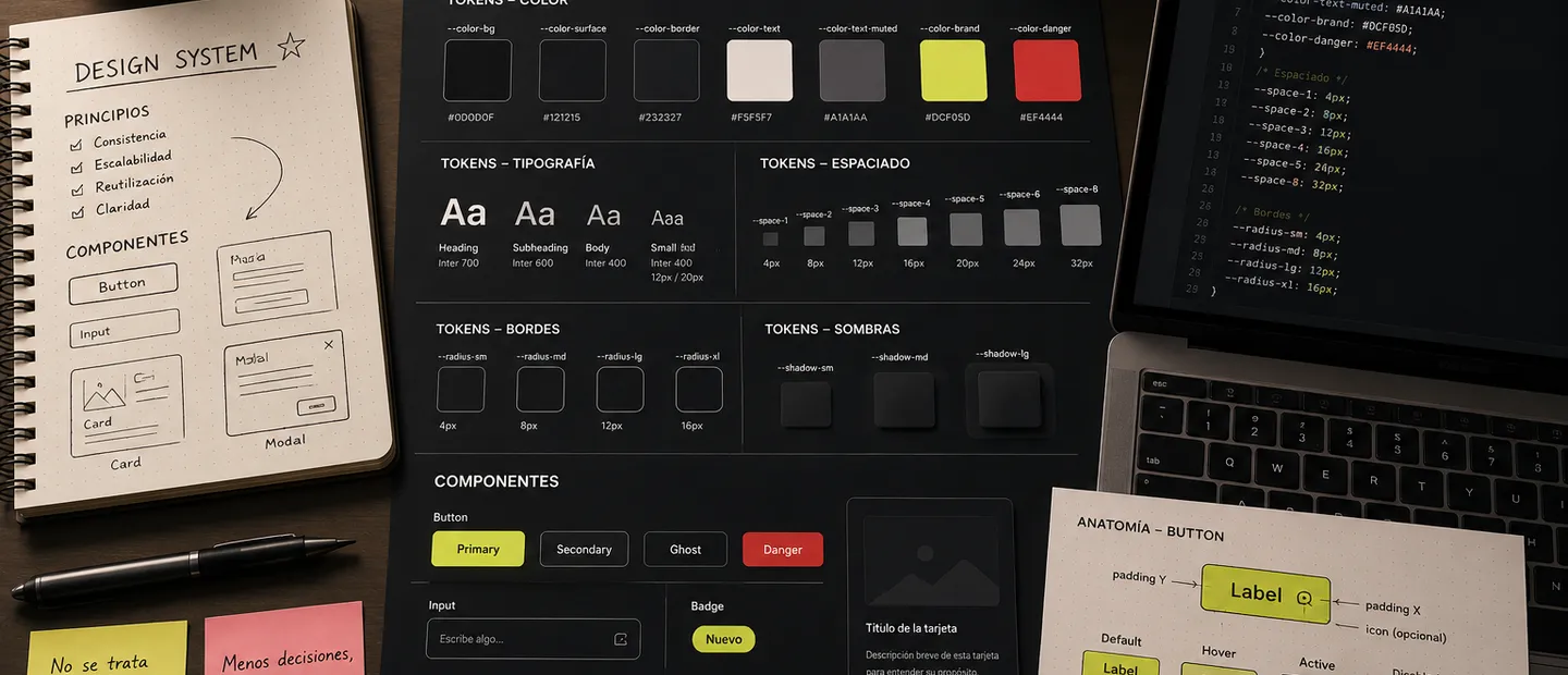
A design system does not need to start as an internal platform, an npm package, or a giant documentation site covering every possible edge case.
For me, a simple design system starts earlier: when you decide buttons will not have five different styles depending on the day, spacing follows a logic, colors have names, and components can be reused safely.
I am not talking about perfection. I am talking about a foundation that helps teams work better.
What I mean by a simple design system
In small and mid-sized projects, I try to avoid two extremes.
The first one is no organization at all. Every screen has its own styles, every component invents its own sizes, and every new section looks like it belongs to a different product.
The second one is building a system far bigger than the real problem. Endless tokens, heavy documentation, variants nobody uses, and a structure that creates more overhead than value.
The sweet spot is in the middle:
- Base styles for color, typography, spacing, radius, and elevation.
- Reusable components for repeated interface pieces.
- Clearly named tokens so we do not depend on random raw values.
- Simple rules to decide when to create something new vs. reuse.
That already gets you far.
I start with style foundations
Before thinking about components, I want the visual base to be clear.
I do not need a massive brand manual. But I do need to know core colors, text behavior, spacing scale, and surface style.
I usually split this into small groups:
- Color: background, surface, border, primary text, secondary text, accent, and states.
- Typography: families, sizes, weights, and line-heights.
- Spacing: a short scale I can repeat without overthinking.
- Borders: radius and stroke thickness.
- Elevation: shadows/layers, if the product needs them.
The key is: these values should not live hidden inside each component.
If one button uses #dcf05d, a card uses a similar green, and a badge uses a third almost-identical one, the system starts breaking. I would rather define a token like --color-brand and let the whole project speak that language.
Then come tokens
Tokens are names for design decisions.
They are not magic. They do not make an interface good by themselves. But they make consistency and change management much easier.
Instead of raw values everywhere:
.button {
	background: #dcf05d;
	border-radius: 8px;
	padding: 12px 16px;
}
I prefer:
:root {
	--color-brand: #dcf05d;
	--color-surface: #121215;
	--color-border: rgba(255, 255, 255, 0.12);

	--space-2: 8px;
	--space-3: 12px;
	--space-4: 16px;

	--radius-md: 8px;
}

.button {
	background: var(--color-brand);
	border-radius: var(--radius-md);
	padding: var(--space-3) var(--space-4);
}
Looks like a small difference, but it matters once the project grows.
Changing one color, radius, or spacing scale stops being a codebase-wide search. And names communicate intent better than raw values.
Global tokens and semantic tokens
I separate two token groups mentally.
Global tokens are base values:
--gray-100--gray-900--green-400--space-4--radius-md
Semantic tokens describe usage:
--color-bg--color-surface--color-text--color-text-muted--color-brand--color-danger
In small projects, I often do not need a huge global token layer. I can work directly with semantic tokens and keep it simple.
The important part is not naming things based only on current appearance. If I call a token --color-green-button, the day the button is no longer green, the name is wrong. If I call it --color-action-primary, it holds up much better.
Components: fewer, but deliberate
Not everything should become a reusable component.
A common trap is abstracting any HTML block too early. If something appears once, or its future behavior is still unclear, I let it live for a while before abstraction.
I usually create components when one or more of these are true:
- It appears on multiple screens.
- It has clear states or variants.
- It encapsulates an interaction.
- It has visual rules I want to protect.
- It removes noise from page code.
Typical examples:
ButtonInputCardBadgeModalTabsArticleCardCallout
The goal is not a giant components folder. The goal is a useful one.
Variants without overcomplicating
A component can become complex very quickly if you try to cover every scenario from day one.
For buttons, I usually start with few variants:
primarysecondaryghostdanger
And few sizes:
smmdlg
That already covers most interfaces. If a real need appears, we add it. I do not design variants for hypothetical cases.
I also try to make variants represent intent, not decoration. primary makes sense. greenBigRoundedWithShadow does not.
Structure I usually use
Framework changes the syntax, but the idea is similar:
src/
├── components/
│   ├── Button.astro
│   ├── Card.astro
│   ├── Badge.astro
│   └── Callout.astro
├── styles/
│   ├── global.css
│   ├── tokens.css
│   └── prose.css
└── layouts/
    └── BaseLayout.astro
In tiny projects, I can even keep it all in global.css as long as it stays manageable.
The structure does not need to impress anyone. It needs to be easy to understand when you revisit the project in three months.
Document just enough
Small design system docs should not become a burden.
Often, three things are enough:
- Which tokens exist and what they are for.
- Which components exist and their supported variants.
- Which rules should not be broken.
Example:
Button
- primary: main action in a view
- secondary: alternative action
- ghost: low-emphasis action
- danger: destructive action
No need to write a novel for each component. But leave enough breadcrumbs so the system does not depend only on your memory.
When to create something new
This is one of the most important decisions.
Before creating a new color, size, component, or variant, I ask:
- Does something similar already exist?
- Is the difference intentional or only cosmetic?
- Will this repeat?
- Am I solving a real case or inventing future flexibility?
- Does this make the system better or harder to use?
If the answer is not clear, I usually wait.
A simple design system is also maintained by saying no.
What I try to avoid
There are clear signs a system is drifting:
- Too many tokens nobody knows when to use.
- Components with too many props.
- Variants built for one-off cases.
- Hardcoded values inside pages.
- Small but constant visual inconsistencies.
- Documentation nobody updates.
When this appears, you do not always need a full rewrite. Sometimes renaming tokens, deleting dead variants, and realigning components with tokens is enough.
Conclusion
For me, a good simple design system is not the one with the most pieces. It is the one that reduces repeated decisions.
If each new screen forces me to decide border color, text size, card padding, and button style again, the system is not helping.
If I have clear tokens, well-chosen components, and simple rules, work flows better. The interface becomes more consistent, code is easier to read, and changes stop feeling risky.
That is the goal: not a perfect design system, but one that helps the project without getting in the way.